The Tie hub
UX Design • Visual Design
The Tie Hub
Scope
UX research, information restructuring, UI design, visual direction, design system.
Tools Used
Figma, Photoshop, Illustrator
Role
Product & Brand Designer
Duration
3 Weeks
What This Project Was Really About
Redesigning a clearer buying journey for a fashion accessories brand
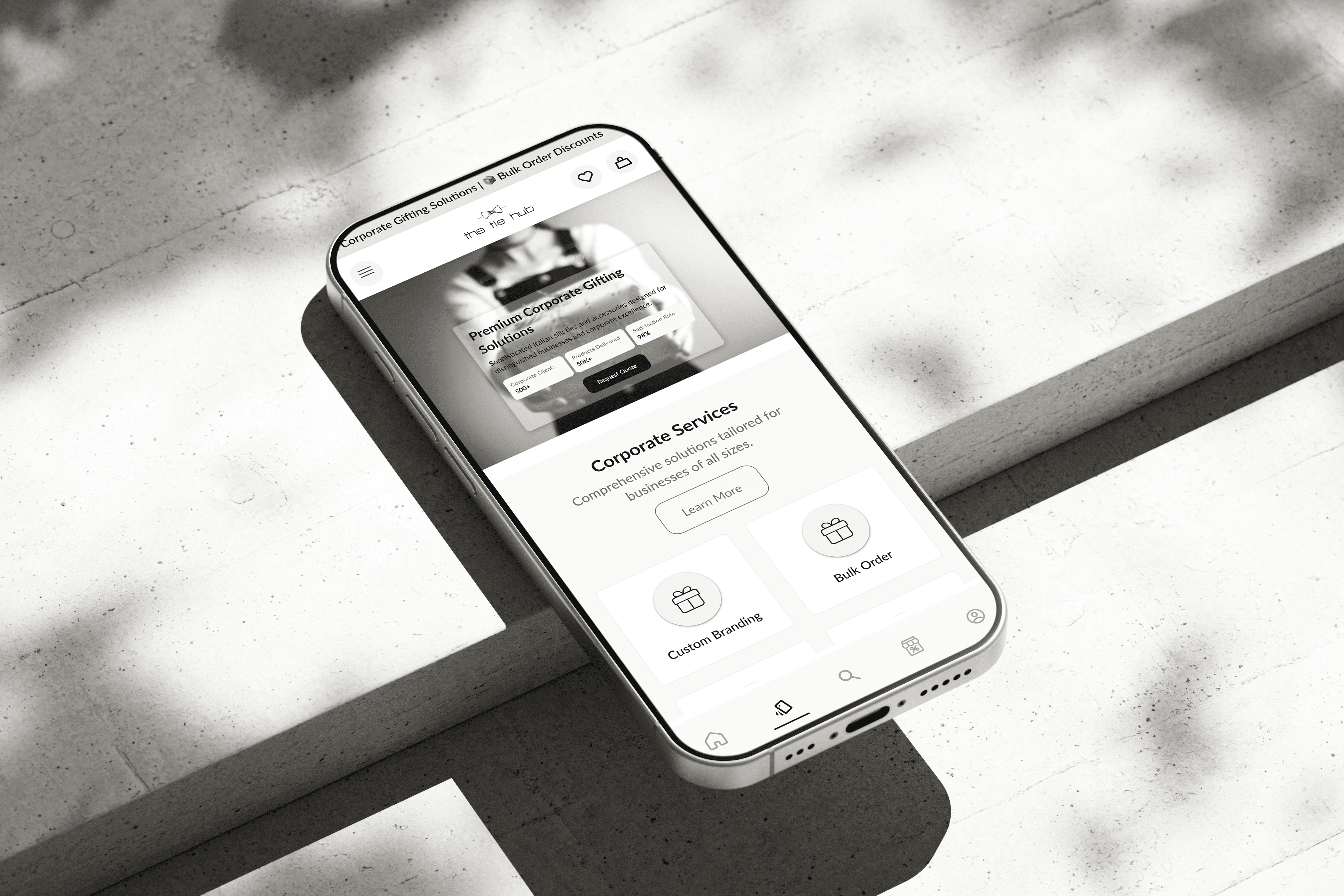
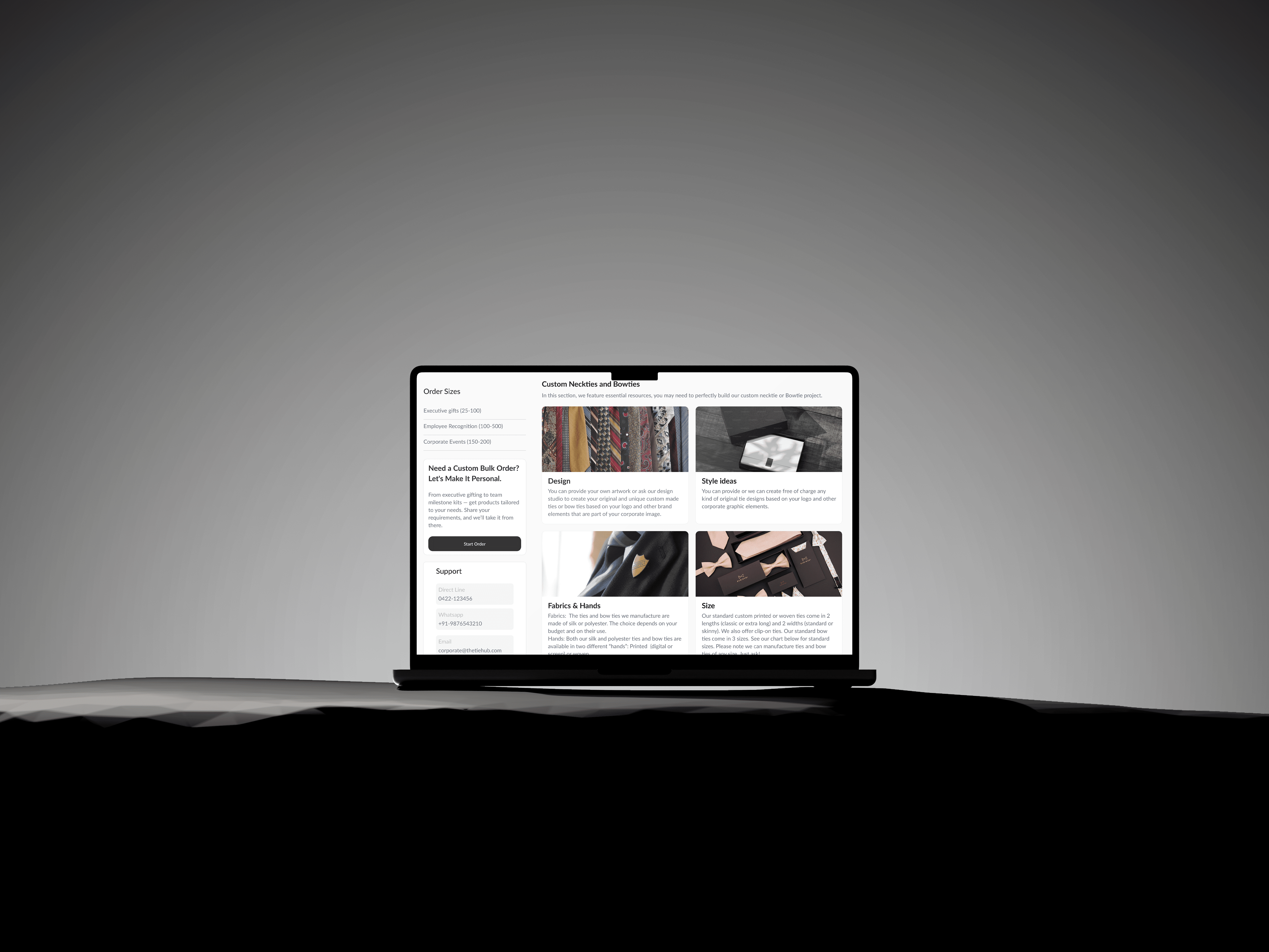
The Tie Hub needed a smoother shopping flow for users exploring ties, cufflinks, and accessories. I led the UX revamp, restructuring categories, mapping flows, and designing streamlined wireframes for the upcoming UI phase.
What Was Blocking Growth & Conversions
A cluttered shopping flow that made users drop off
The site had overlapping categories, unclear paths, and an inconsistent product hierarchy. Users struggled to find the right product variant and reach checkout without friction.

Insights That Shaped the Direction
Users wanted clarity, fewer steps, and predictable filters
Users often bounced on category pages due to unclear segmentation.
PDP lacked strong hierarchy, making details hard to scan.
Checkout required too many steps before payment.
Mobile layout wasn’t optimized for quick browsing.


Design Thinking in Motion
Iterating toward a cleaner fashion shopping experience
I created multiple iterations of IA, flows, and page layouts to reduce cognitive load. The key focus was predictability — fewer decisions per screen, more clarity per interaction.


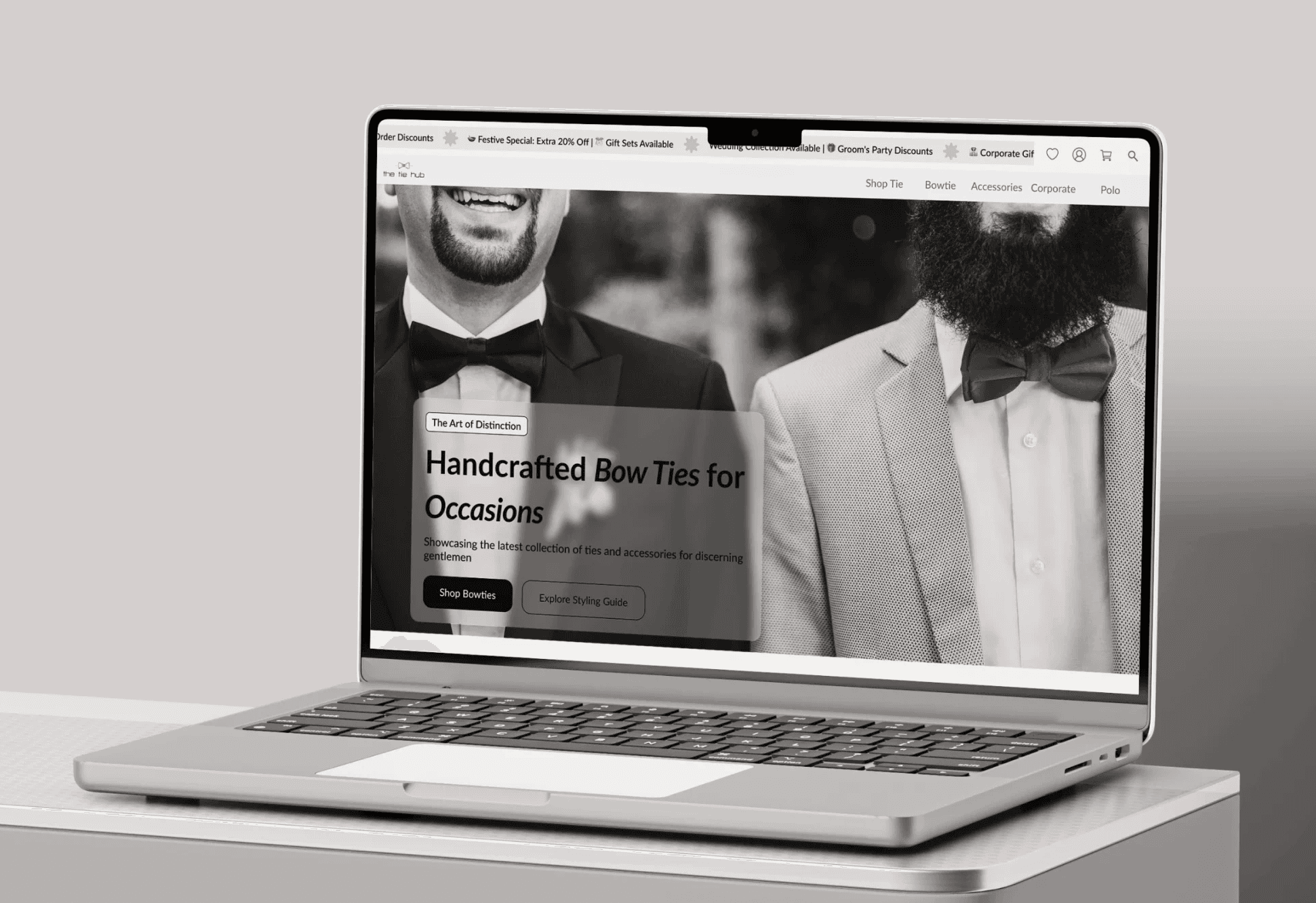
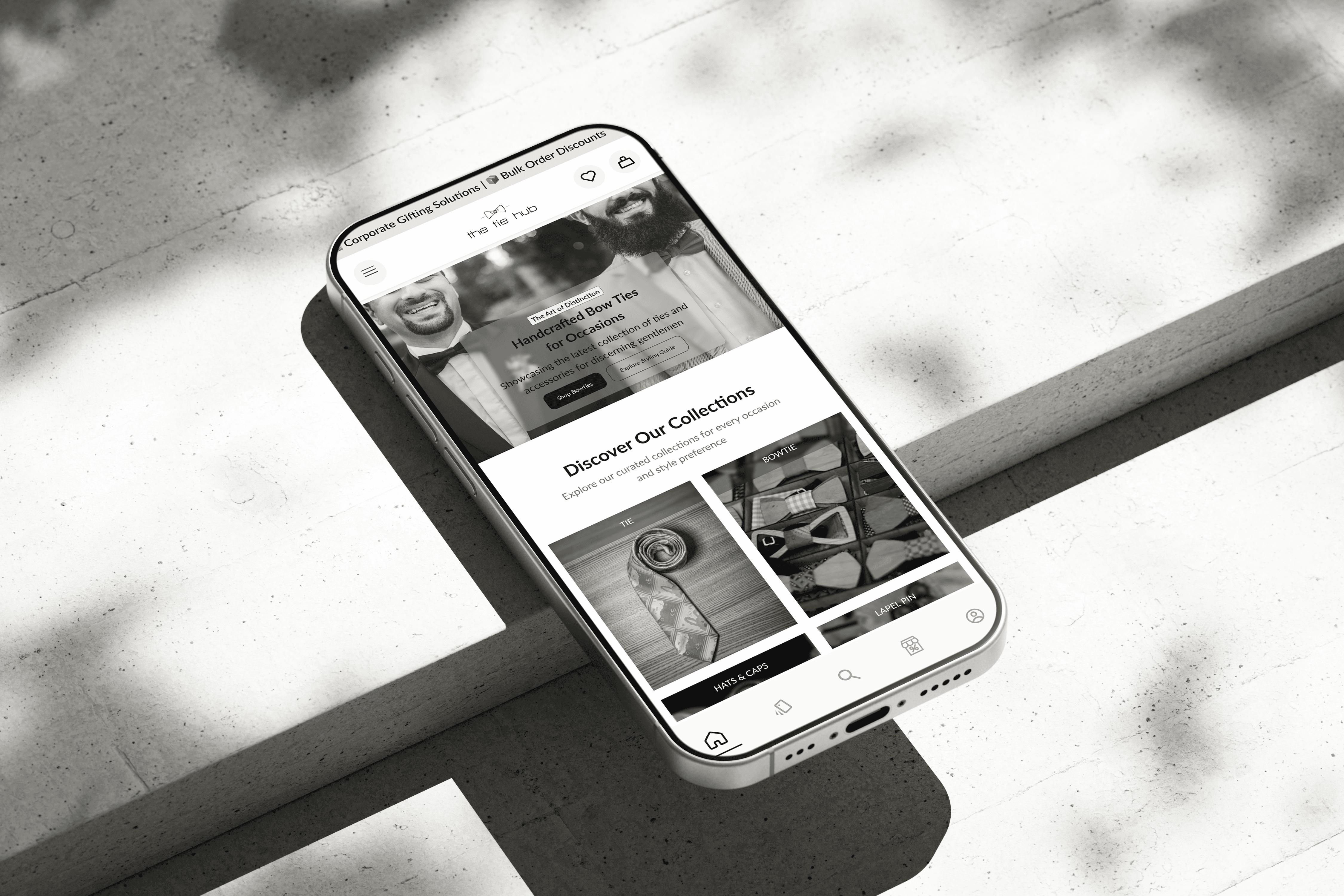
The Final Experience (Clean & Transaction-Ready)
A predictable fashion e-commerce flow simplified and structured.
I built wireframes for homepage, category pages, PDP, and checkout that focused on scannability, hierarchy, and intent-driven actions.


How The Redesign Helped
Iterating toward a cleaner fashion shopping experience
I created multiple iterations of IA, flows, and page layouts to reduce cognitive load. The key focus was predictability — fewer decisions per screen, more clarity per interaction.
What I Personally Contributed
UX Flow & Architecture:
Refined categories and reduced cognitive friction for shopping paths.
Wireframes:
Explored multiple layouts to find the right balance of clarity and elegance.
UI System:
Created a modular system including:
• Buttons
• Cards
• Grids
• Type hierarchy
• Product alignment rules
High-Fidelity UI:
Polished desktop & mobile screens that express premium craft through minimalism.


Who I Collaborated With
Business Stakeholders
“Aligned on product priorities and sales goals.”
E-commerce Team
“Refined filters, sorting logic, and merchandising rules.”
Developers
“Validated interaction patterns and checkout feasibility.”
Future Opportunities
Where the experience can evolve next
Add personalized recommendations.
Introduce product bundling (tie + cufflink sets).