
Ekaaya Collaroot
Brand Identity • Packaging • Social Media System

Ekaaya Wellness
Scope
End-to-end design: logo system, colour palette, typography, packaging design (Kumkumadi), and a scalable Instagram visual identity.
Tools Used
Illustrator • Photoshop • Figma • Lightroom • Gemini AI
Role
Brand and Packaging Designer
Duration
Ongoing
Overview
Ekaaya is an Ayurvedic collagen wellness brand created to bridge ancient rituals with modern beauty routines. I led the brand’s identity from the ground up — defining the visual world across logo, packaging, and social language.
Why This Project Mattered
Ayurvedic beauty is crowded with traditional motifs, while collagen supplements often feel too clinical.Ekaaya needed a distinct position: warm, natural, science-aligned, and aspirational - without looking generic.
The challenge was to design a brand with:
Modern trust
Soft emotional appeal
Enough neutrality to stay unisex
This balance became the foundation of the identity.

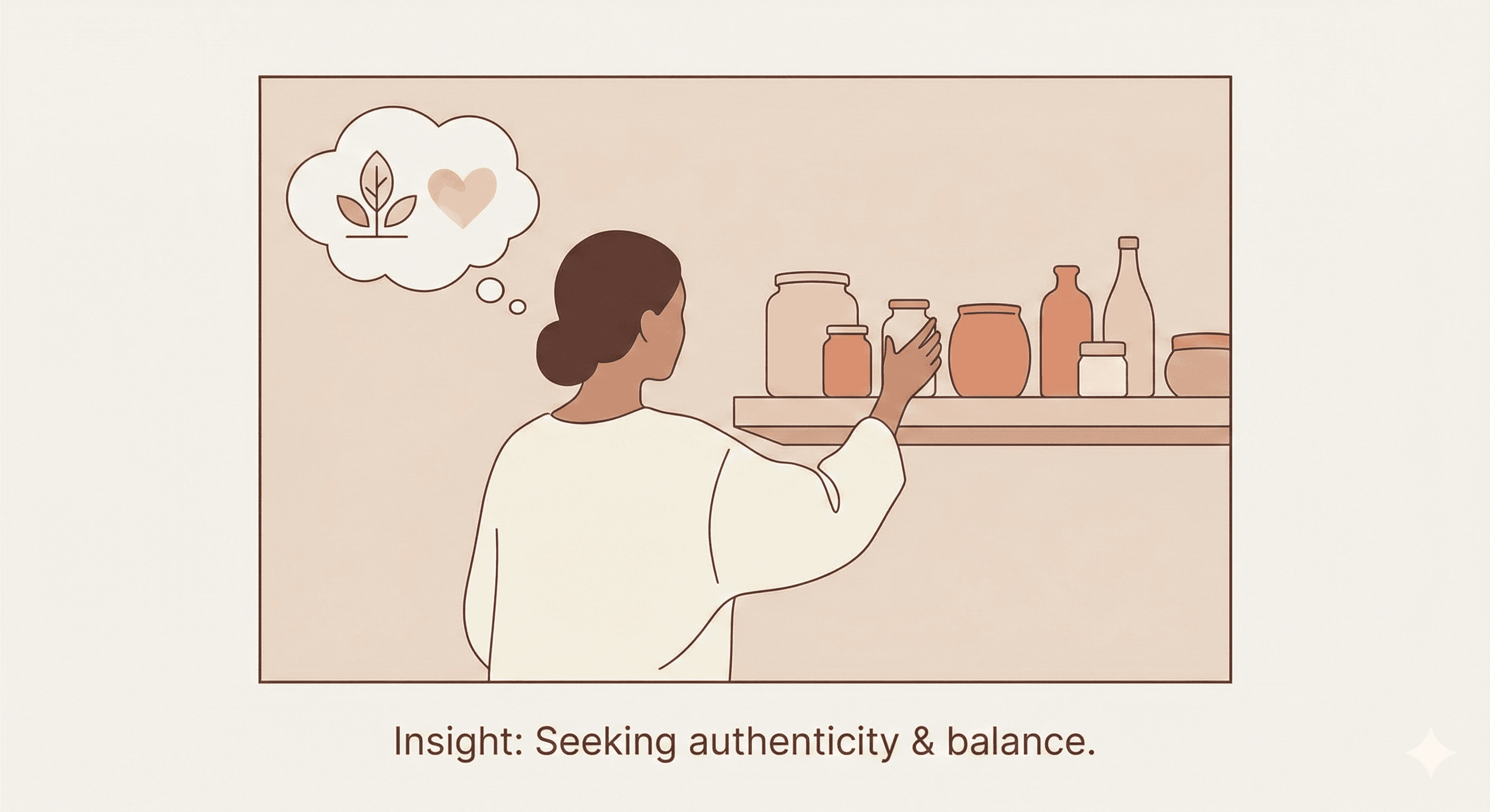
Where the Gaps Were
To understand where Ekaaya should sit visually and tonally, I evaluated:
Collagen brands → cold, medical, hard-science
Ayurveda brands → overly ornamental, saturated
New-age D2C wellness → minimal but repetitive
A visual space existed between “ritual” and “results” calm, feminine-neutral, premium, trustworthy.


Design Direction & Strategy
Our guiding idea became “Everyday Glow” — not transformation, not miracle claims, but consistency, calmness, and wellness that feels personal.
The strategy anchored in:
Soft, breathable layouts
Earth-leaning neutrals
Tactile textures
Ingredient-first storytelling
Minimal geometry inspired by Ayurvedic balance
This direction guided every brand decision.


System Development
Logo System
Built using symmetrical geometry to symbolize harmony, alignment, and self-balance.
Sharp enough for scientific trust, soft enough for wellness.
Color Palette
Muted terracotta, nude, ivory, and brown-grey neutrals.
Chosen for a natural + premium + unisex feel.
Typography
Sans-serif for clarity, soft serif accents for warmth.
Together they create a balance of science + soul.
Packaging System
A clean modular grid that supports:
Ingredient hierarchy
Claim clarity
Premium minimalism
Subtle gold & texture for depth
Social Media System
Built a scalable content system:
Ritual-based storytelling
Scientific credibility frames
Soft lifestyle photography direction
Product-led stories + UGC-like moments
Consistent tone: calm, reassuring, real
This created instant brand recall. Optimized for both shelf presence and D2C landing pages.


Impact
Our guiding idea became “Everyday Glow” — not transformation, not miracle claims, but consistency, calmness, and wellness that feels personal.
The strategy anchored in:
Soft, breathable layouts
Earth-leaning neutrals
Tactile textures
Ingredient-first storytelling
Minimal geometry inspired by Ayurvedic balance
This direction guided every brand decision.
My Contributions
Led brand strategy direction
Designed the complete identity system (logo + palette + type)
Built packaging architecture + final mockups
Developed the social media grid system
Prepared brand guidelines for handoff
Everything - from research to execution - was done end-to-end.


Collaborators / Credits
Content validation and ingredient copy were provided by the Ekaaya team. All visual design, packaging, and system development were independently created by me.
Next Steps
Extend packaging system to full wellness line .
Introduce motion identity for social
Build D2C landing page design
Create lifestyle photo direction + prebuilt templates