
Kumkumadi Packaging
Branding • Packaging

Sqin Botanicals
Scope
Led end-to-end packaging design for Spin Botanical’s full Kumkumadi skincare range.
Tools Used
Illustrator, Photoshop
Role
Packaging & Brand Designer (Intern)
Duration
6 Weeks
What This Project Was Really About
Designing a premium Ayurvedic packaging system that builds trust
Sqin Botanical partnered with us to redesign their Kumkumadi Facial Oil packaging — a heritage-led product that needed a clearer, more luxurious presence. I led the full packaging redesign for a seven-product Ayurvedic skincare line, balancing authenticity with modern retail expectations.
What Was Limiting Brand Perception
A first-time product that needed credibility and shelf presence
Ayurvedic beauty is often visually traditional or overly ornate. Spin Botanical wanted to elevate its Kumkumadi line into a premium, contemporary category without losing cultural depth.
The goal:
Create packaging that feels crafted, pure, global, and unmistakably luxurious.
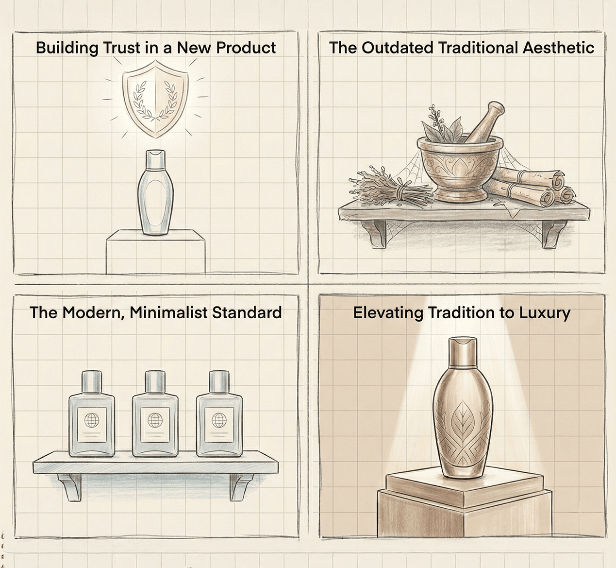
Insights That Shaped the Direction
Luxury cues need subtlety, not loud design
Early assessment revealed:
Unpolished visual hierarchy
Lack of tactile sophistication
Weak shelf presence against premium competitors
No unified system across the seven SKUs
Insight:
Luxury in Ayurveda is expressed not through decoration - but through restraint, materiality, and clarity.
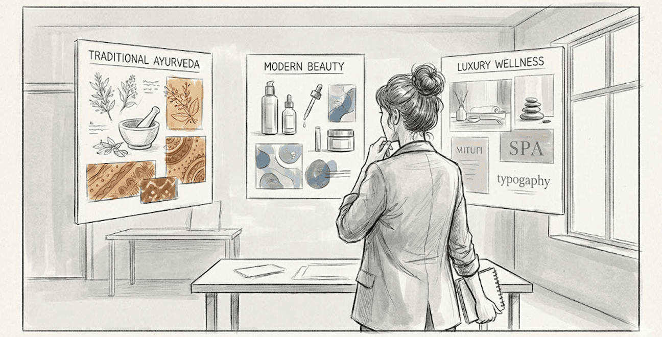
Design Thinking In Motion
The design strategy revolved around “Quiet Heritage” — a calm, confident visual language rooted in Ayurvedic purity yet modern in aesthetic.
Key principles:
Maroon and gold tones → warmth + heritage
Clean geometry → global luxury cues
Rich textures → trust through tactility
Minimal ornamentation → contemporary feel
The system had to feel both calming and elevated, consistent across the entire line..
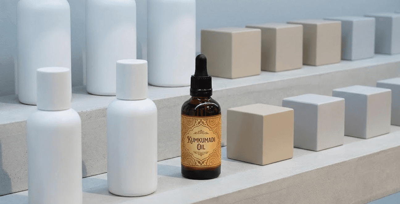
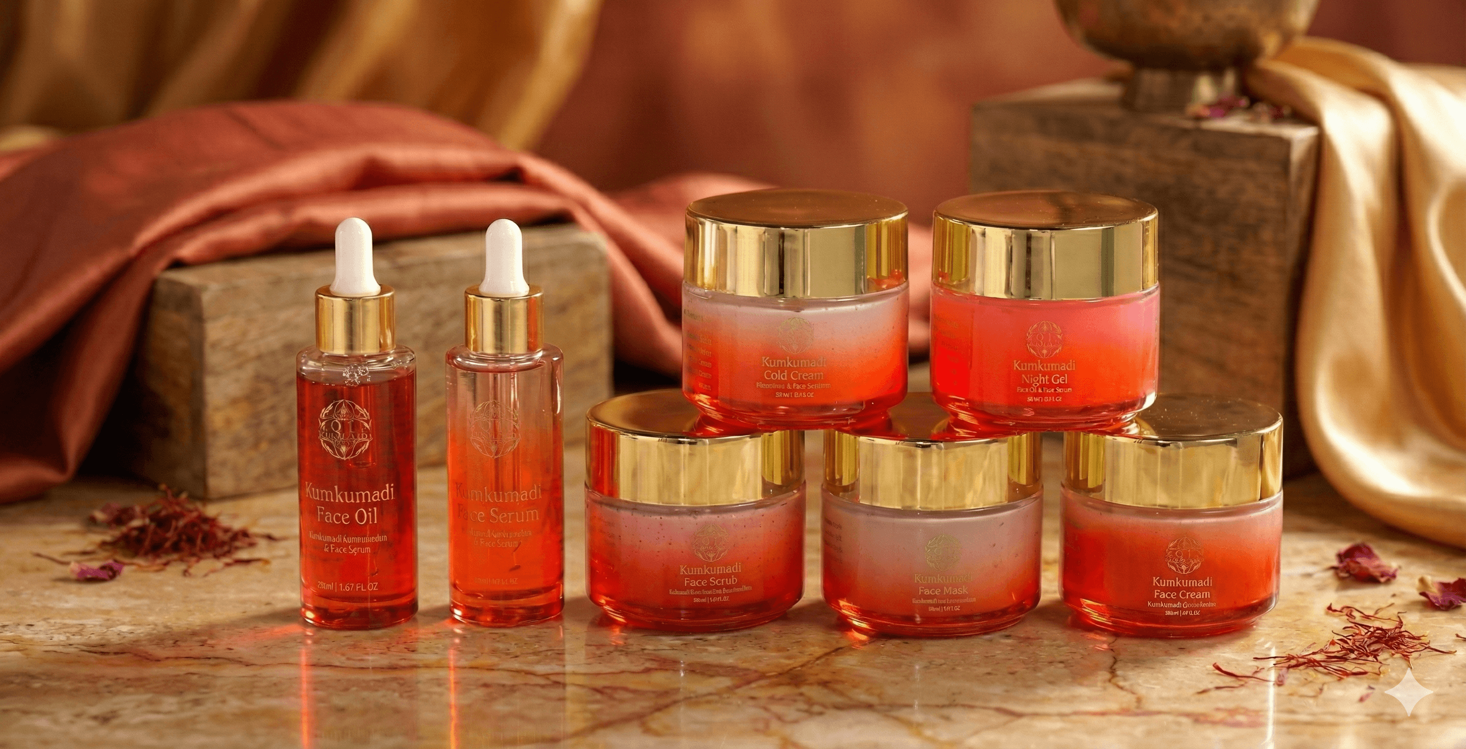
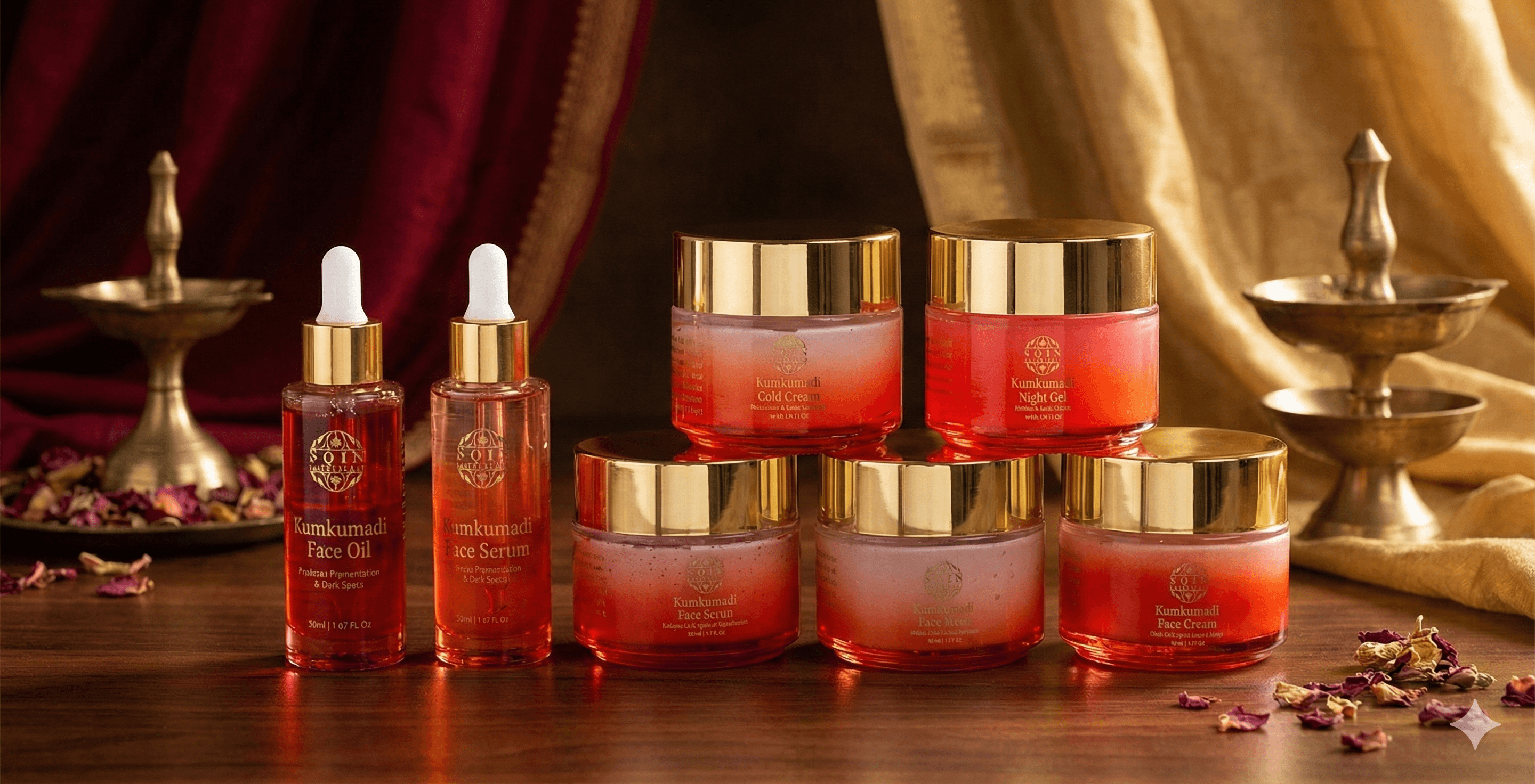
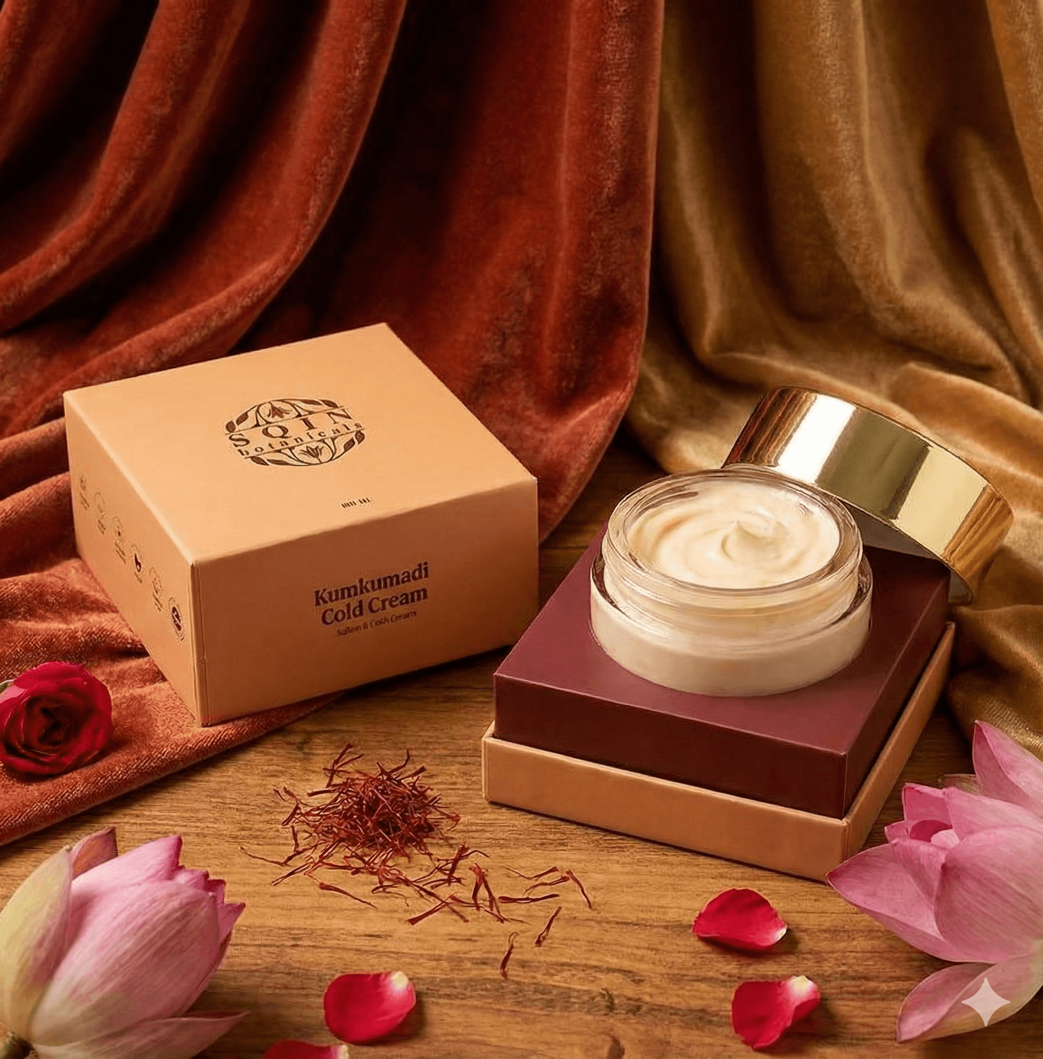
The Final Packaging System
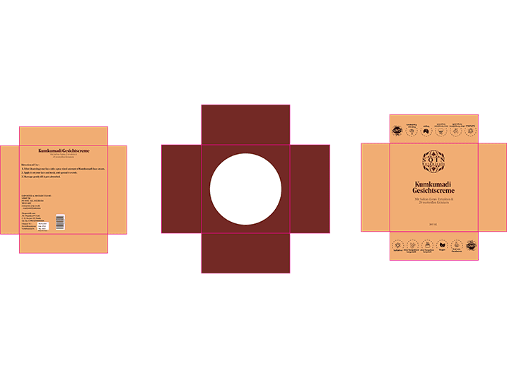
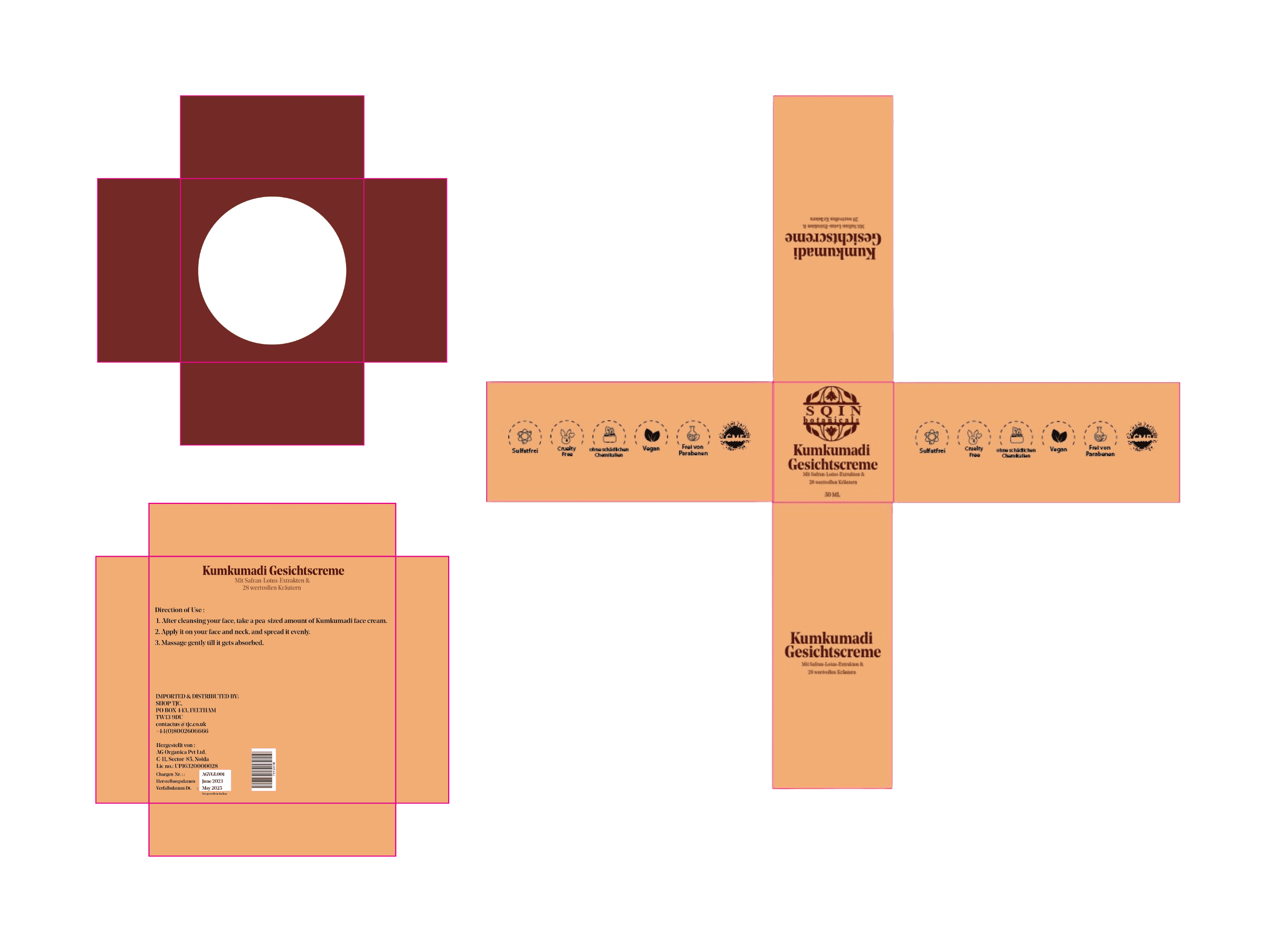
Structural Exploration
Developed multiple dieline studies to balance rigidity, durability, and premium hand-feel.
Color System
Refined maroon–gold palette for deeper contrast, shelf visibility, and luxury alignment.
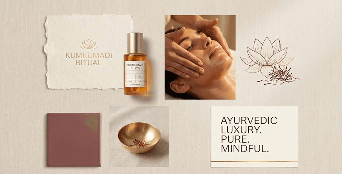
Typography System
Serif-led primary type for tradition
Sans-serif secondary for modern clarity
Grids ensured labels stayed clean and compositional.
Material & Finish
Spot UV detailing
Soft-touch laminate
Gold foil elements
The packaging became a tactile narrative - luxury felt before it is seen.

How The Redesign Helped
The design strategy revolved around “Quiet Heritage” — a calm, confident visual language rooted in Ayurvedic purity yet modern in aesthetic.
Key principles:
Maroon and gold tones → warmth + heritage
Clean geometry → global luxury cues
Rich textures → trust through tactility
Minimal ornamentation → contemporary feel
The system had to feel both calming and elevated, consistent across the entire line..
What I Personally Contributed
Brand Story Translation
“Converted Ayurvedic heritage into modern luxury cues.”
Packaging Structure
“Designed bottle + box system for clarity and premium feel.”
Label Design
“Created hierarchy, typography, and ingredient storytelling.”
Color & Finish Decisions
“Crafted saffron-gold palette and material accents.”
Who I Collaborated With
Client Team
“Aligned on ingredient storytelling and Ayurvedic positioning.”
Packaging Manufacturer
“Finalized material feasibility and finish options.”
Creative Director
“Reviewed structure, hierarchy, and premium cues.”